fbpx

Category : Design

HomePosts in Design

Design and Business in the world of COVID-19

Recently I was able to attend Remote Design week by the Design X community, a community of designers here in Canada and around the world. One of the many talks that had great insight into our current situation was by Adam Fry-Pierce, Director of Customer Experience Programs at Invision. He talked about many great insights from design leaders on design and business during COVID-19. I will be discussing 4 of these insights and what design leaders believe is going on currently and will be happening in the near future.

The first insight from Adam I would like to talk about is that The Digital transformation has accelerated. Digital now has not only been becoming one of the best channels to connect with customers but according to Adam in most cases, Digital is the only place to connect with the customer. Brands that used to be able to connect through in-person customer experiences now have to pivot to connect digitally. B2C brands are turning to digital design teams to quickly help them pivot to the current climate.

The second insight that Adam talks about that is very relevant is that Teams are designing for the “social distance economy”. Businesses within various industries such as restaurants and sports are creating new revenue channels.  Design has never been more important, so this means design teams are now having to really understand the current problems and having to come up with new experiences and solutions.

The COVID-19 has created a climate of empathy and caring is the third insight Adam discussed. Teams are now starting their meetings differently and expressing empathy, for example asking questions like “How are you?”. This climate is having teams come closer together and be more human. Design and business leaders are expressing empathy towards various aspects within their teams such as their families, peers, and the local community.

The last insight which I think is one of the most important ones is that Designers need to know how to communicate their business value. Design leaders and designers need to focus on the importance and urgency of communicating in the business language to be able to really rise.

Invision provides some great free resources for designers which I’m reading now.

Remote work for Design Teams By Ben Goldman, Abby Sinnott, and Greg Storey

 Business Thinking for Design Leaders by Ryan Rumsey

Vanessa Cuartas is an Integrated Media Designer at ruckus Digital.

Need help with your social strategy? Drop us a line.

2019 Reflection: Planet Fitness Awareness Campaign

Back in 2017, ruckus Digital successfully launched the Planet Fitness Canada social channels. While new locations are regularly opening across the nation, as a newer gym in Canada, there is still a level of education and brand awareness required for the Canadian audience.

December and January is a busy time for the fitness industry as Canadians look to join gyms and fulfill fitness New Year’s resolutions. To put Planet Fitness at the forefront of Canadian minds, we needed to create an awareness campaign that would tell social media users who Planet Fitness is and why they should join.

Since Planet Fitness’ brand voice is fun and sassy, we wanted to develop a campaign that not only boasted Planet Fitness membership perks and prices (which are extremely competitive), but that also stayed true to their unique tone. As an added challenge, we wanted to attribute as much of our budget as possible to paid social advertising to maximize reach, which meant we wanted to create assets without the use of production studio.

The result was a “Reactions” campaign – a series of overly and comically expressive stock models in Planet Fitness branded imagery with captions that spoke to Planet Fitness features in relatable, meme-like ways.

There was a moment during the ideation where I found myself feeling genuinely concerned we were going to have a hard time finding a winning idea – but when the idea came, it felt so natural and obvious, and one of those few times where you toot your own horn and think “genius!”

Once the base of the idea was created, the captions came easily, and it’s a campaign I’m very proud of.

The campaign ran from the end of December 2018 until early 2019 and resulted in over 1.75 million impressions and an average engagement rate of 12%, compared to an average engagement rate of 5% on always-on content.

A big takeaway I got from this project is realizing how a simple can idea can have a maximum effect. Despite brainstorming bigger ideas that would be more complex and harder to execute, the winning idea ended up being the one that was simplest to execute – meaning we could put those dollars directly back into media spend, which our team and the client team was very happy about.

Amanda Carreiro is the Senior Digital Content Manager at ruckus Digital.

Check out more 2019 highlights here!

#FutureForward: Tap into your inner emotions through design

In our #FutureForward series we ask members of our ruckus family to share their insights into what two skills they think will still be relevant in public relations, communications, marketing and digital in 30 years.

Vanessa Cuartas , integrated media designer at ruckus Digital, discusses the various layers of design that are directly related to emotion.

Every morning we wake up to a whole new different day, but something you may not realize that remains constant are the various emotions that we go through daily when interacting with different products. Whether it is our Starbucks app to get our coffee, our Spotify app to listen to our music, or just interacting with our computers at work, all these interactions cause an emotion.

This is why in the world of design; emotional design is something that will not be going away anytime soon – even 30 years from now it will still be relevant. Designers now more than ever have to take into consideration the emotions users may experience when interacting with their products.

“Emotional design strives to create products that elicit appropriate emotions, in order to create a positive experience for the user,” according to the Interaction Design Foundation.

In the book Emotional Design: Why we love (or hate) everyday things,

Don Norman talks about the three different levels of the emotional system: the visceral, behavioural and reflective levels. These levels heavily influence design in their own way.

Visceral design taps into our immediate reactions when encountering a product, basically is it love at first sight. At this level, we are essentially looking at the product’s branding.  

Behavioural design is all about how we interact with a product, how it performs or how easy it is to learn to use. For example, this could be the pleasure to be able to find a contact on your phone or the difficulty of typing on a small screen. The behavioural level taps into the emotions you feel when accomplishing or failing to complete our goals. 

Reflective design is all about how the product makes us feel after we’ve used it, for example, or how we feel when we don’t have it. Do we feel a sense of fomo, for example?

By taking a closer look at these different levels, designers will have a better sense of what they are creating for the world and their consumers. These levels will allow them to think deeper about how their product not only looks, but how it will be used and the feeling the users will get when it has been used. 

Vanessa Cuartas is an integrated media designer at ruckus Digital. Need help with your social media approach? Drop us a line.

So, what is User Experience Design?

After much reading, research and attending the UX Design Bootcamp from Miami Ad School Toronto, I could tell you that User Experience Design can be defined in many ways.

It all comes down to one common theme –the interaction and value that a product will provide to the user when using the product. Whether it is a website, tablet or even an app the user’s satisfaction should always be the main focus when developing the end product.


“Design is not just what it looks like and feels like. Design is how it works.” Steve Jobs


What needs to be included in User Experience Design?

There are different facets or qualities of user experience according Peter Morville from Semantic Studios. Peter developed what we call the user experience honeycomb.

The 7 facets of the Peter Morville Honeycomb are useful, usable, desirable, findable, accessible, credible, and valuable.  This honeycomb helps brands define their products’ priorities, therefore providing a good experience for the user.


What is the User Experience Design process?

The User Experience Design process has different phases that are repeated, to help evaluate the design of the end product. A good example is the Double Diamond Design process, which has four steps: discover, define, develop and deliver.

Through the Discovery phase, a lot of research takes place, including primary and secondary research, competitive analysis, stakeholder interviews, user journeys, and more.

In the Define phase all the information from the Discovery phase is gathered and narrowed down to a creative brief.

Then comes the fun part, the Development phase where ideation takes place to come up with unique concepts based on the creative brief. These concepts are created, prototyped, tested and iterated. This is the part where the ideas are also refined to what works and what doesn’t.

After a lot of trial and error comes the last phase, the Delivery phase, this where the project is finalised and launched.

In the end User Experience Design is all about the customer needs versus their wants.


At this point in experience design’s evolution, satisfaction ought to be the norm, and delight out to be the goal. Stephen Anderson


Following a good design process such as this one, will not only help you have a great product but a valuable user experience.

Vanessa Cuartas is an integrated media designer at ruckus Digital. Need help with design? Drop us a line.

Meet our integrated media designer

Vanessa Cuartas is ruckus Digital’s newest team member, joining our design shop.

Florida native, Vanessa attended the University of Central Florida and graduated with a Bachelor of Arts, majoring in graphic design. Following her undergrad, she attended the Miami Ad School for Advertising. Here’s what she had to say about her role.

1. Who inspires you?

“I’m inspired by many people in my life but the main people who inspire me are Paula Scher, American graphic designer, painter and art educator, and Jessica Hische, American letterer, illustrator and type designer. However, I do believe the most important thing to get inspiration from is everything around you.”

2. What’s the coolest thing you’re working on right now?

“I could honestly say all the projects I’m working on are very cool. All of the projects have a different objective, look and feel, which is something I’m enjoying. It allows me to get out of my comfort zone and design in different styles. One of my favourite projects so far was the Black Friday animations for Walmart and some RSA (insurance) animations as well.”

3. Who in the agency would you most like to swap places with for a day?

“Gary Edgar, VP, creative and design at ruckus digital: it would be amazing to see the process of how he comes up with different ideas and strategies for the projects he works on.”

4. How do you get out of a creative rut?

“If I’m in a creative rut, I like to leave the project or zone and go do something else. I love to paint, which is what I do to relieve any stress and just put my feelings out there. Then I come back good as new.”

5. What is the most important piece of advice you could give for someone starting a career in graphic design?

“Don’t take life too seriously, enjoy the ride. Be prepared to give and receive feedback and learn from the experience.”

6. What’s the most important lesson you’ve learned in the last year?

“Always keep learning and be open to new things, even if they are outside of your comfort zone!”

Need some creative inspiration for your communications? Drop us a line.

Drive engagement through Millennials ‘early onset nostalgia’

With fierce competition from other leading online and bricks and mortar retailers, the holiday shopping season is the most difficult time of the year to capture a customer’s attention. Walmart Canada needed a creative approach to break through the noise and entice Canadian shoppers to choose Walmart for their Black Friday (in-store and online), Cyber Monday (online) and Boxing Week (in-store and online) shopping.

According to Digiday, experts say that factors such as the coming of age during economic turmoil has meant millennials end up romanticizing simpler times – even times they weren’t around for – which the industry has diagnosed as millennials’ ‘early onset nostalgia.’ (As seen in Throwback Thursdays or Wayback Wednesdays online conversations.)

Building on this ‘early onset nostalgia,’ an IABC Silver Leaf award-winning illustration and animation series was developed with a nostalgic twist to get millennials ‘ready for their big shopping day’ through retro-styled workout stretches.

Industry best practices indicate short videos improve audience engagement. A more recent move has been to look at platform-specific variations to improve impressions. According to Mobile Marketer, consumers spend 98 per cent of their time using their phone in portrait mode. Square videos also perform better on certain platforms.

A 10-second square video animation series was created for Twitter, Facebook and Instagram, while vertical videos were pushed through Snapchat. YouTube videos were also added to the mix. The videos included exercises in retro gear with workouts such as squats (i.e. to lift your big-ticket in-store purchase) and finger stretches (i.e. to tap for your online purchases).

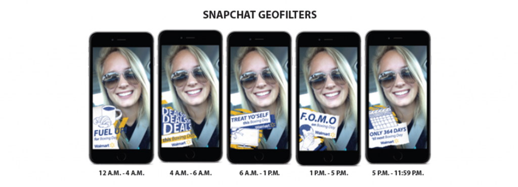
Since Black Friday and Boxing Day offered in-store shopping experiences, five in-family day-parted Snapchat geofilters were designed for each day for individuals to share their Walmart-inspired shopping experiences through a selfie.

The video campaign targeted millennial Twitter followers, Snapchat users, Instagram fans, Facebook fans and YouTube users.

The campaign allowed Walmart Canada to maintain its leadership position during these peak shopping days during the holiday season. The geofilters also ranked within the top worldwide on the platform – the only Canadian brand to do that in Q4 (even beating out the 2 US presidential candidates’ geofilters per capita).

Need help targeting Millennials through your social content? Drop us a line.


How to add a fresh twist to your social media content

Have any of your married friends or those in committed relationships ever asked to play with someone else’s dating apps (just because they were curious)?

According to a Google Consumer Survey ruckus Digital commissioned in spring 2017, about a quarter of Canadian millennials know someone who has. This insight gave us the perfect opportunity to get fresh (groceries, that is) with our Walmart millennial audience.

Dinnder was a 10 to 15-second social media video ad series (throughout spring/summer 2017 long weekends, including Victoria Day, Canada Day and the Civic Holiday), created to improve Walmart’s quality perception and spread awareness about its new 100% Canadian AAA Angus Beef.  Delicious cuts of beef were paired with attractive sides made with Walmart’s fresh produce.

How: By drawing a connection between a dating app and the brand, we piqued consumer interest in a brand new way – cutting through the long weekend clutter in both English and French Canada – as people were stocking up for their long weekend get-togethers.

The vertical video series (to align with the vertical orientation for swiping on popular dating apps) ran on Facebook and Snapchat. The series was among the top pieces of social content for Walmart in summer 2017.

As marketers, we constantly have to rethink how we reach consumers/audiences and stand out in the crowd. Take a look at our Dinnder videos and let us know what you think!


Need help with your paid social media strategy and targeting? Drop us a line.

Walmart Canada: One-stop shop for groceries, general merchandise and now beer and wine

Canadians are consuming hundreds of pieces of content daily, faster than ever before, which makes it important for brands to capture the attention of users quickly to impact and secure brand recall.

According to Fors-Marsh group tests, it takes only 0.25 of a second of exposure for people to recall mobile feed content at a statistically significant rate. In Facebook’s News Feed people spend, on average, 1.7 seconds with a piece of content. That’s a very short amount of time to capture audience attention.

Taking into account the current social media landscape and how important it is to communicate fast and effectively on social, ruckus digital helped Walmart Canada develop Facebook video carousels to drive awareness of Walmart locations now selling beer and wine.

Here is a summary of this campaign and how it helped Walmart to drive local awareness about it beer and wine offering on social media:

Challenge

The government of Ontario now permits grocery stores to sell beer and wine, giving consumers more convenience and choice. Walmart was looking for a local strategy to communicate to shoppers that select stores now sell beer and wine. Adding to the challenge was that their competitors were also launching their own communications about beer and wine availability.

Solution

Ruckus digital created beer and wine animated cinemagraph carousels that were geo-targeted to local shoppers of select Walmart stores now selling beer and wine. The video cinemagraph carousels helped Walmart stop social media scroll through by creating innovative visuals to help increase local awareness of their expanded in-store offering.

Result

The animated cinemagraph carousels resulted in an increase of 280 per cent engagement and helped Walmart reach an engaged local audience.